from IPython.display import Image, display

display(Image(filename="Screenshot 2025-02-23 215932.png"))
Datawrapper is a powerful, user-friendly online tool designed for creating interactive and visually appealing charts, maps, and tables without requiring programming skills. It is widely used by journalists, researchers, and businesses to communicate data effectively.
Key Features of Datawrapper
Chart Creation 📊 Supports various chart types, including bar charts, line charts, pie charts, scatter plots, and more. Simple drag-and-drop functionality for data uploads. Customizable colors, labels, and legends to enhance visualization.
Interactive Maps 🗺️ Create choropleth maps, symbol maps, and locator maps to visualize geographic data. Supports country-level and regional mapping. Easy-to-use tools for highlighting specific areas and adding tooltips.
Tables & Data Presentation 📑 Helps convert raw data into readable, interactive tables. Supports sorting, filtering, and highlighting key insights. Allows embedding into websites or reports.
Customization & Branding 🎨 Customize fonts, colors, and themes to match branding requirements. Add annotations, tooltips, and data labels to improve clarity. Offers premium features for team collaboration and white-label branding.
Integration & Export Options 🔄 Embed charts and maps into websites using iframe or JavaScript. Export visualizations as PNG, SVG, and PDF for offline use. Compatible with Google Sheets and other data sources for real-time updates.
from IPython.display import Image, display
display(Image(filename="Screenshot 2025-02-23 215932.png"))
from IPython.display import Image, display

display(Image(filename="Screenshot 2025-02-23 220614.png"))
from IPython.display import Image, display

display(Image(filename="Screenshot 2025-02-23 221229.png"))
from IPython.display import Image, display

display(Image(filename="Screenshot 2025-02-23 222210.png"))
While DataWrapper doesn’t require coding, it does require use of csv files or datasets for visualization. We can proceed as follows.
from IPython.display import Image, display

display(Image(filename="Screenshot 2025-02-23 231312.png"))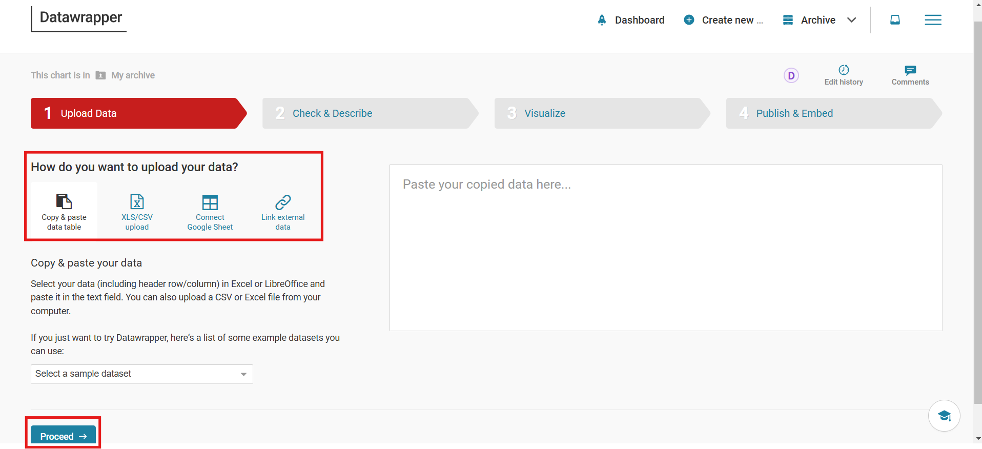
For ex. using the sample dataset
from IPython.display import Image, display

display(Image(filename="Screenshot 2025-02-23 231454.png"))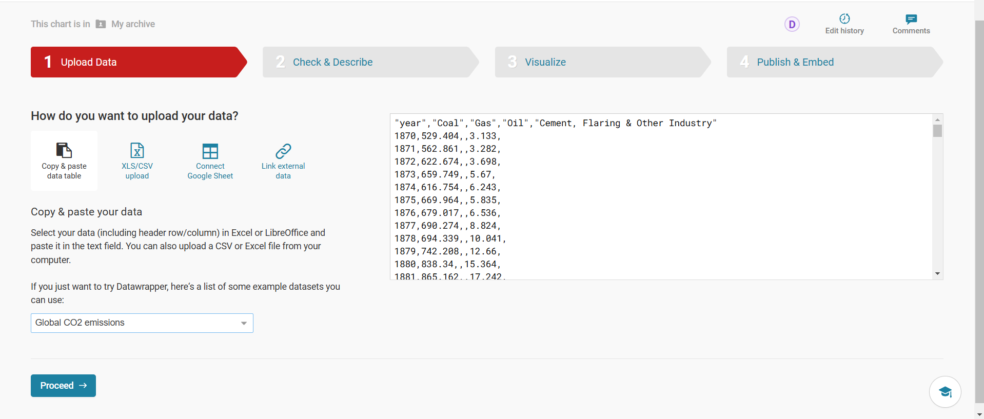
We can also edit the columns by sorting them or search among the dataset. We can also swap the rows and columns or add columns according to our needs.
from IPython.display import Image, display

display(Image(filename="Screenshot 2025-02-23 231956.png"))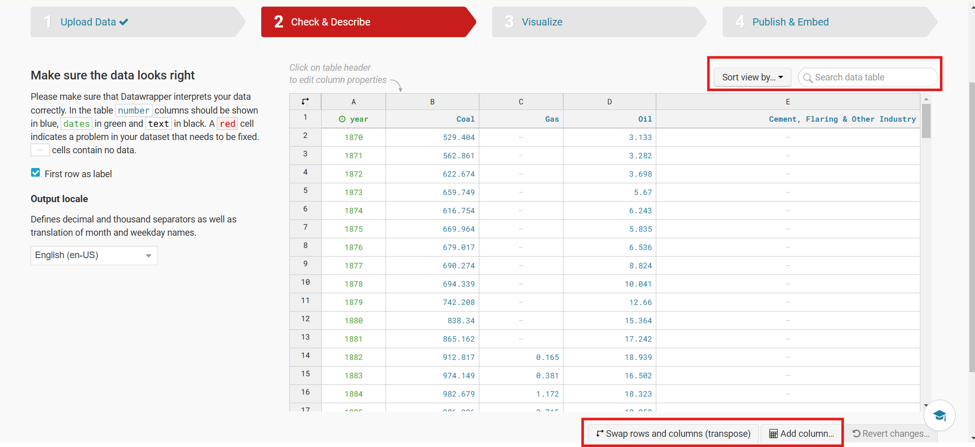
We can also selectively remove columns in order to visualize particular patterns.
from IPython.display import Image, display

display(Image(filename="Screenshot 2025-02-23 234258.png"))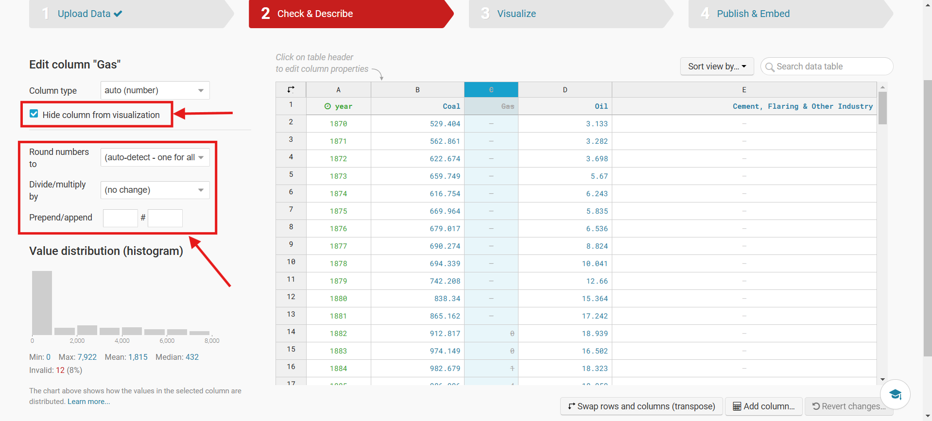
from IPython.display import Image, display

display(Image(filename="Screenshot 2025-02-24 010424.png"))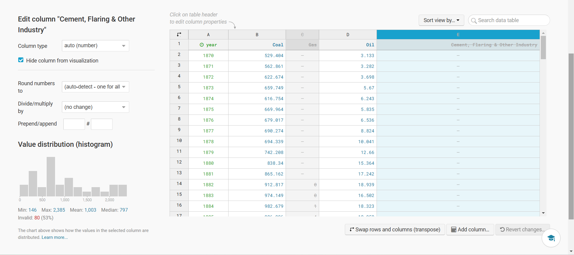
In Datawrapper, we have a wide range of charts to choose from to get the best visualisation for our data. We can select any but it is automatically selected first time which is pretty accurate. We can also change how we preview the graph using size of graph, colorblind accessibility and dark mode.
from IPython.display import Image, display

display(Image(filename="Screenshot 2025-02-24 010558.png"))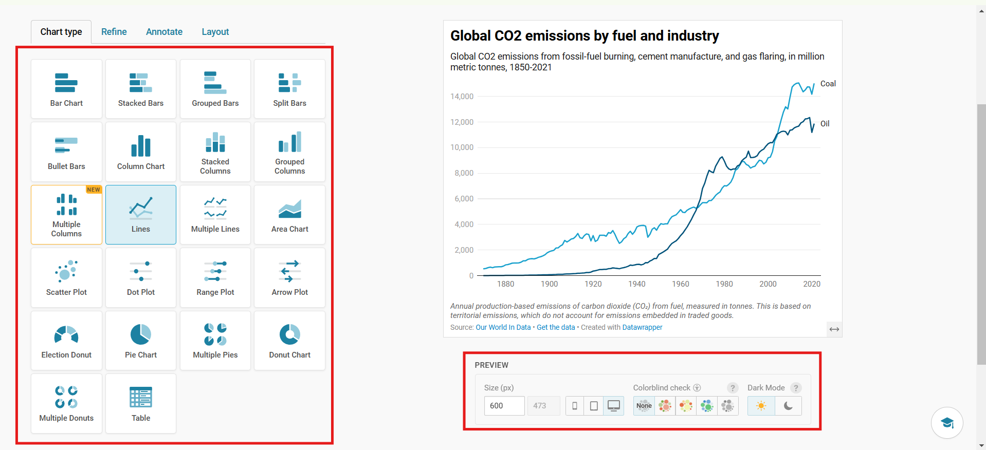
We can also individual access graphs in order to analysis the data in case of multiple graphs
from IPython.display import Image, display

display(Image(filename="Screenshot 2025-02-24 011234.png"))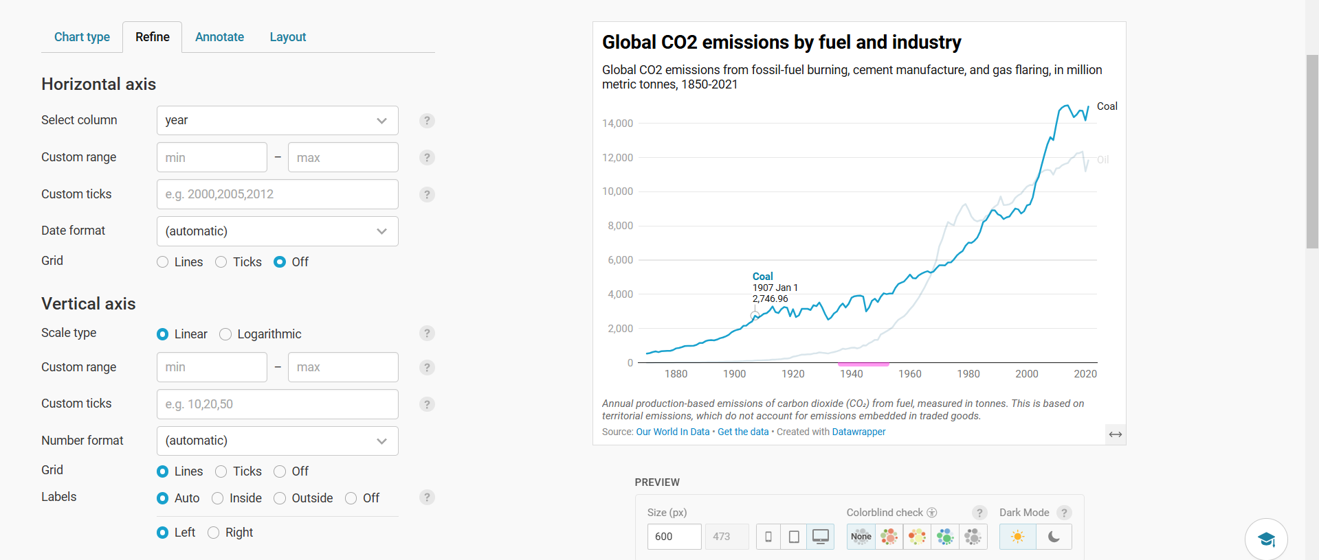
In the “Refine” Section, we can change the horizontal column like what it represents, change the scale of vertical axis, add grids, labels, etc.
from IPython.display import Image, display

display(Image(filename="Screenshot 2025-02-24 011843.png"))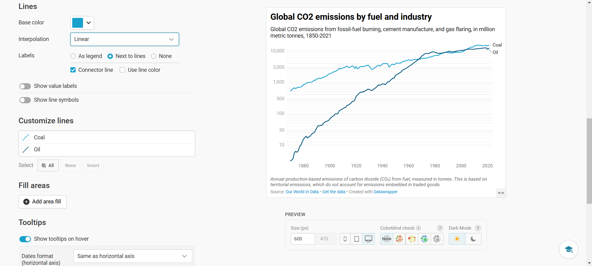
We can also change the line interpolation from linear to curved for smoother curve and change the color to our liking. We can also add value labels at the start and end. We can also add a legend using “As legend”.
from IPython.display import Image, display

display(Image(filename="Screenshot 2025-02-24 012122.png"))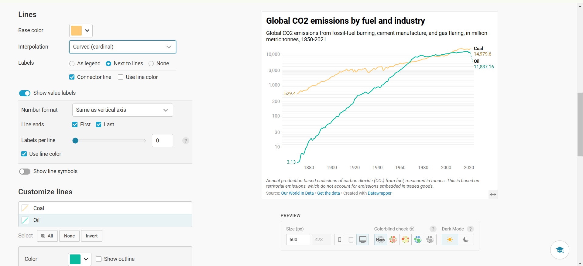
We can also add a area fill to track the difference between the values of each graph. We can also add a negative fill area.
from IPython.display import Image, display

display(Image(filename="Screenshot 2025-02-24 012746.png"))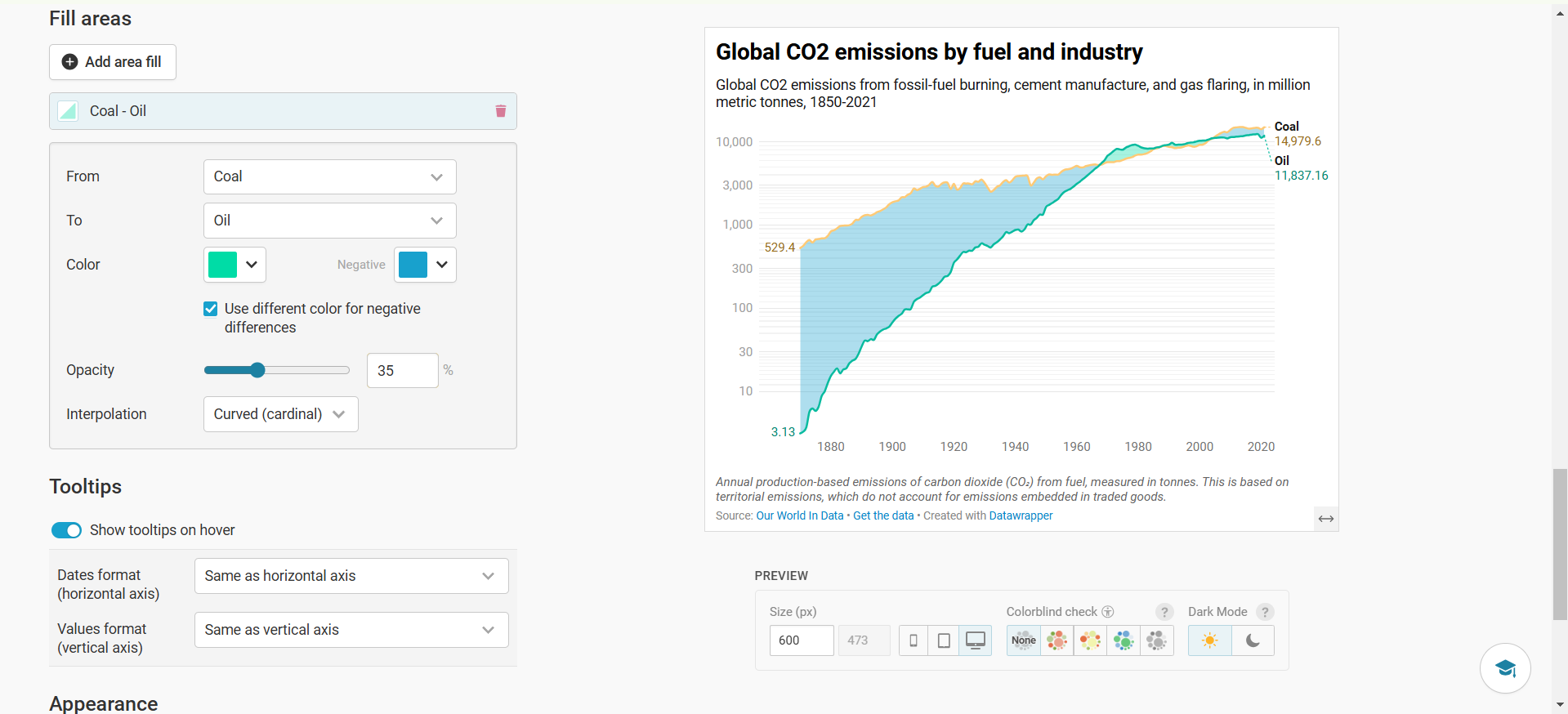
from IPython.display import Image, display

display(Image(filename="Screenshot 2025-02-24 013009.png"))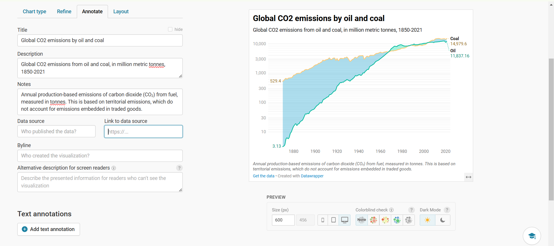
In the “Annotate” we can add a title, description below it and some notes for the reader. We can also add the data source,link and subsequent credits to the author. We can also add a alternative description to make it clear to viewers.
from IPython.display import Image, display

display(Image(filename="Screenshot 2025-02-24 013104.png"))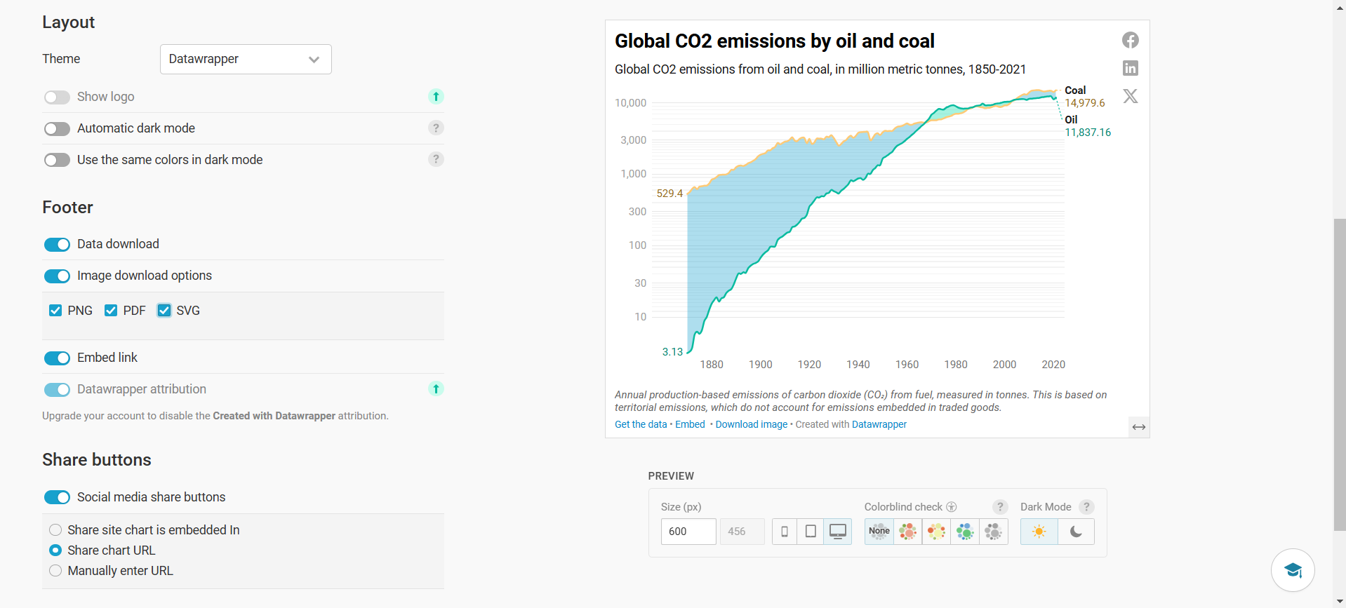
We can publish the graph on the Datawrapper website along with some social media share buttons for publicity. We can also keep download options from png to pdf.
from IPython.display import Image, display

display(Image(filename="Screenshot 2025-02-24 013136.png"))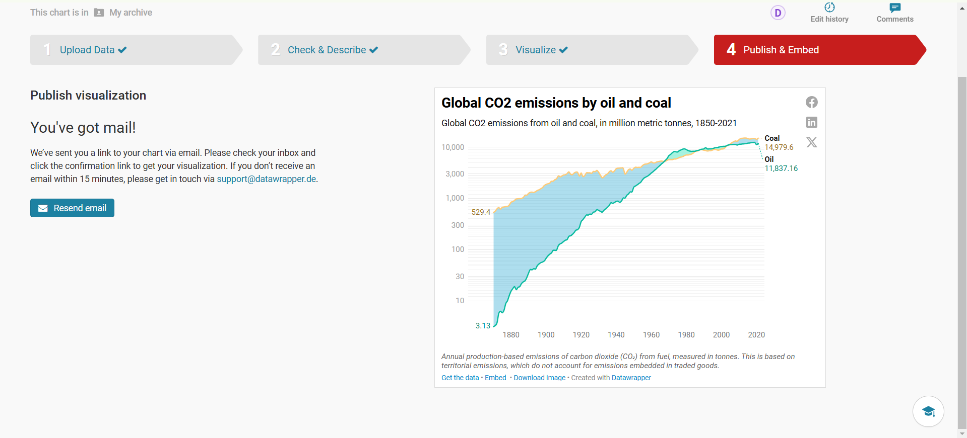
We just made a chart in Datawrapper using a sample dataset and best of its features combined. A few examples have also been provided to understand it better.
Here’s the dataset
import pandas as pd
df=pd.read_csv("State_data.csv")
df.head(5)| State | Population | Area (km2) | |
|---|---|---|---|
| 0 | Uttar Pradesh | 199812341 | 240928 |
| 1 | Maharashtra | 112374333 | 307713 |
| 2 | Bihar | 104099452 | 94163 |
| 3 | West Bengal | 91276115 | 88752 |
| 4 | Madhya Pradesh | 72626809 | 308252 |
We want to display only Population data in visualisation. Let us use a bar chart for the same.
from IPython.display import Image, display

display(Image(filename= "Screenshot 2025-02-24 020448.png"))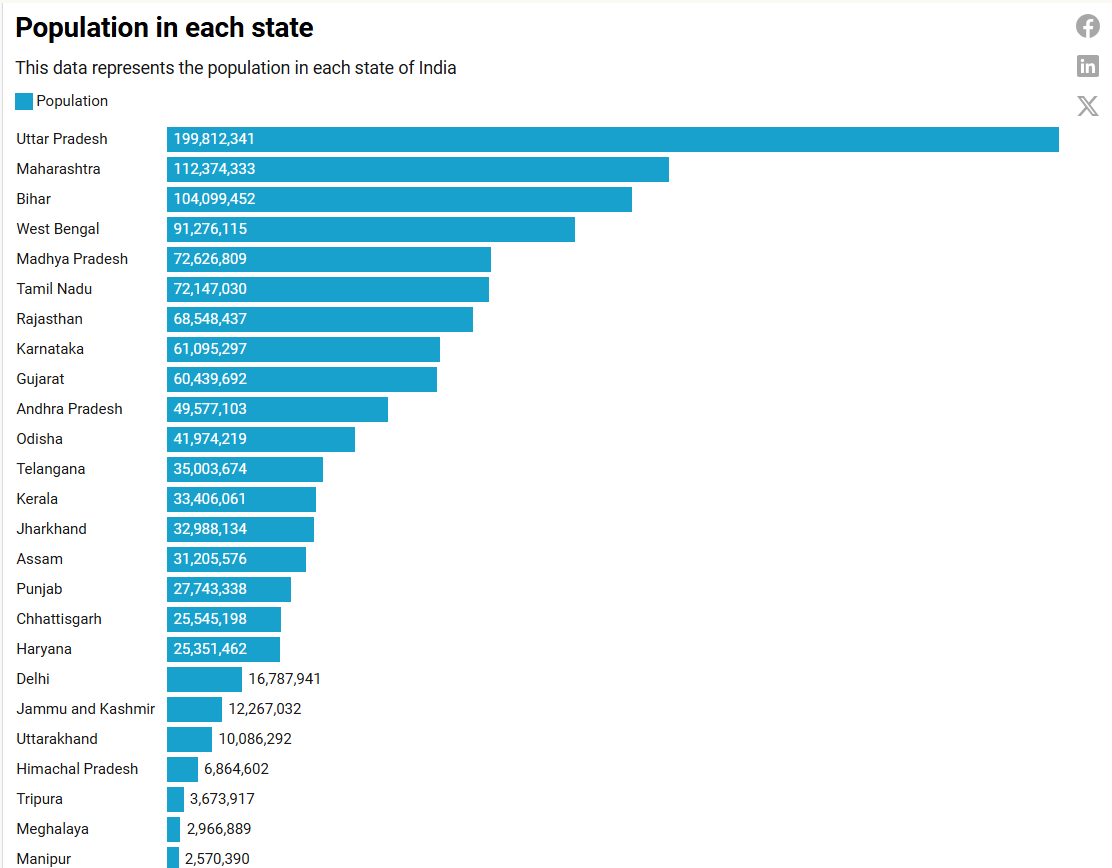
df=pd.read_excel("Ultrasonic diffraction.xlsx")
df.head(5)| SR No. | Micrometer Reading(mm) | Detector Output(Microampere) | Unnamed: 3 | SR No..1 | Micrometer Reading(mm).1 | Detector Output(Microampere).1 | Unnamed: 7 | Unnamed: 8 | Unnamed: 9 | Unnamed: 10 | Unnamed: 11 | |
|---|---|---|---|---|---|---|---|---|---|---|---|---|
| 0 | 50 | 0.59 | 0.1 | NaN | NaN | NaN | NaN | NaN | NaN | NaN | NaN | NaN |
| 1 | 49 | 1.09 | 0.2 | NaN | NaN | NaN | NaN | NaN | NaN | NaN | NaN | NaN |
| 2 | 48 | 1.59 | 0.3 | NaN | NaN | NaN | NaN | NaN | NaN | NaN | NaN | NaN |
| 3 | 47 | 2.09 | 0.1 | NaN | NaN | NaN | NaN | NaN | NaN | NaN | NaN | NaN |
| 4 | 46 | 2.59 | 0.3 | NaN | NaN | NaN | NaN | NaN | NaN | NaN | NaN | NaN |
We only want the micrometer reading(mm) vs Detector Output(Microampere). We will be using a line plot.
from IPython.display import Image, display

display(Image(filename= "ultrasonic-diffraction.png"))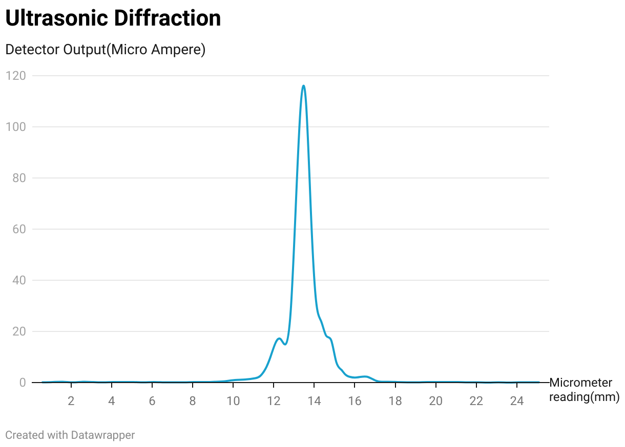
from IPython.display import Image, display

display(Image(filename= "Screenshot 2025-02-24 024716.png"))
We can also add mobile fallback to avoid any server issues with the tables.
from IPython.display import Image, display

display(Image(filename="Screenshot 2025-02-24 032045.png"))
We can add a heatmap to make it visually appealing using our choice of palette, interpolation, color continuation etc.
from IPython.display import Image, display

display(Image(filename="Screenshot 2025-02-24 033236.png"))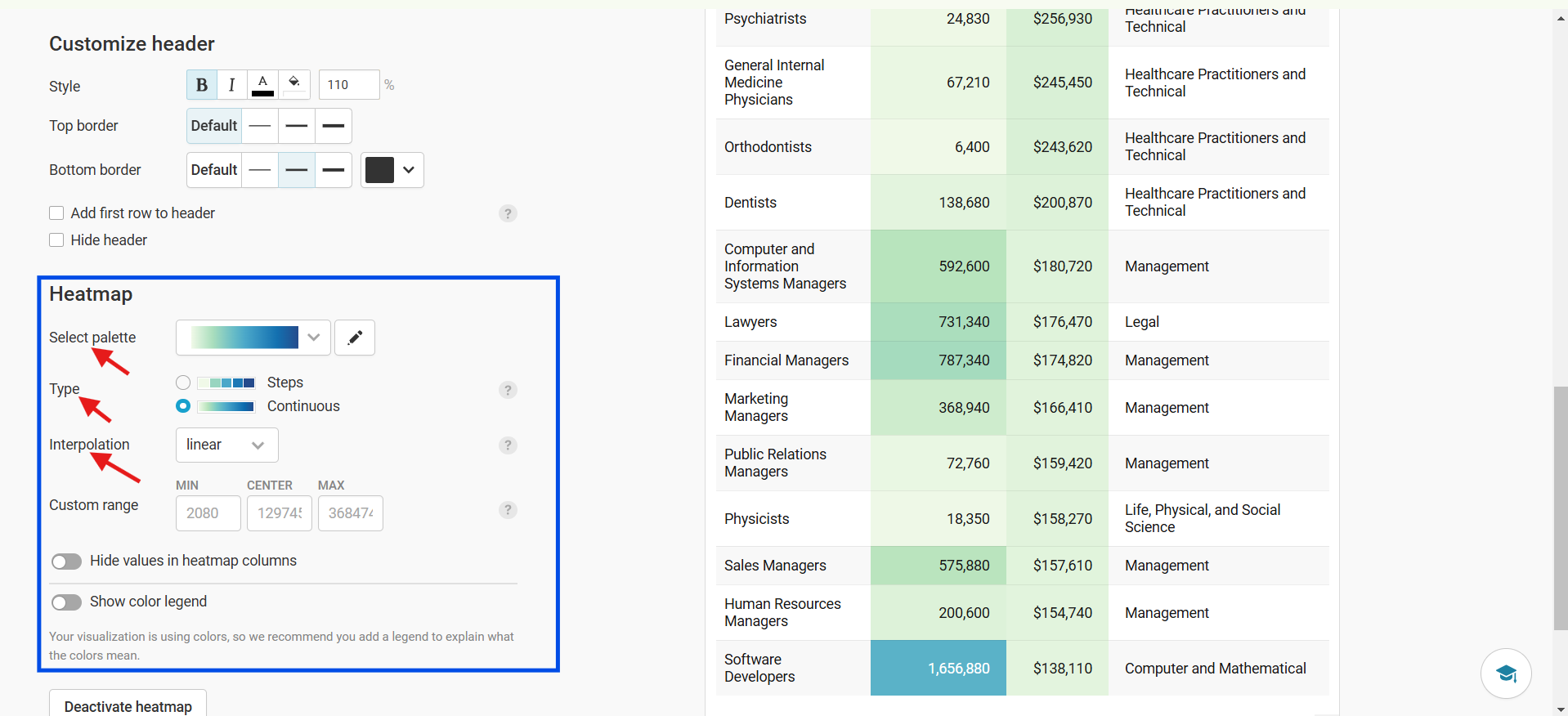
from IPython.display import Image, display

display(Image(filename="Screenshot 2025-02-24 033743.png"))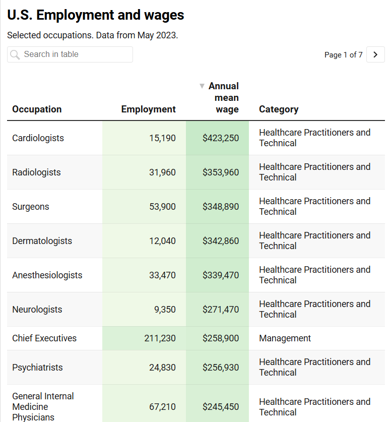
from IPython.display import Image, display

display(Image(filename="Screenshot 2025-02-24 034227.png"))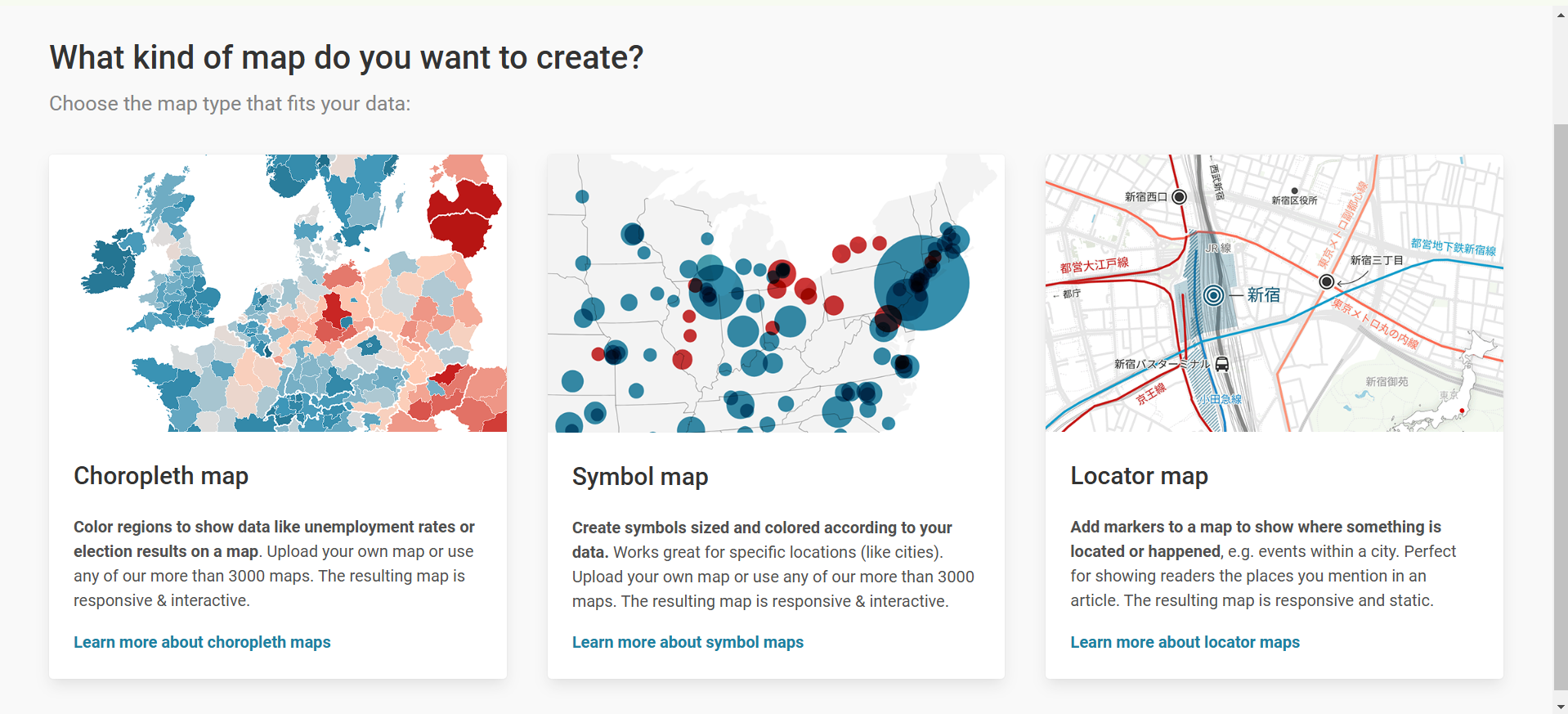
Choropleth Map
We will showcase maps using choropleth map as an example. We are given a choice of humongous number of maps from around the world.
from IPython.display import Image, display

display(Image(filename="Screenshot 2025-02-24 034829.png"))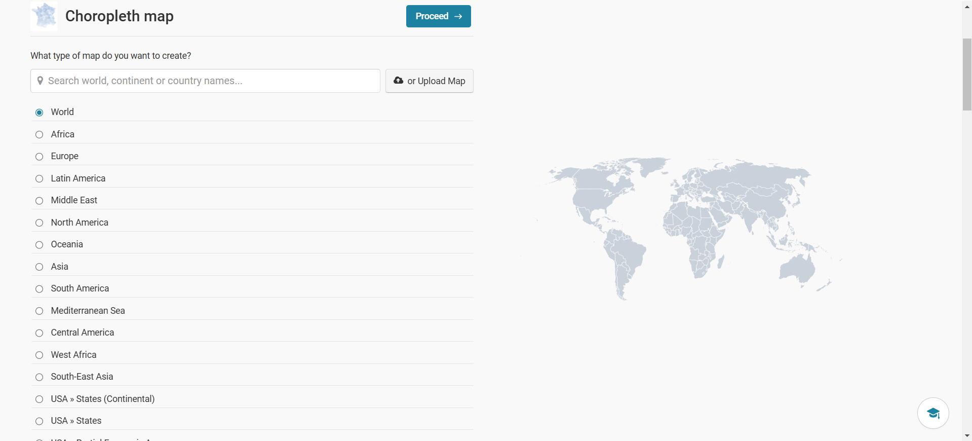
from IPython.display import Image, display

display(Image(filename="Screenshot 2025-02-24 035351.png"))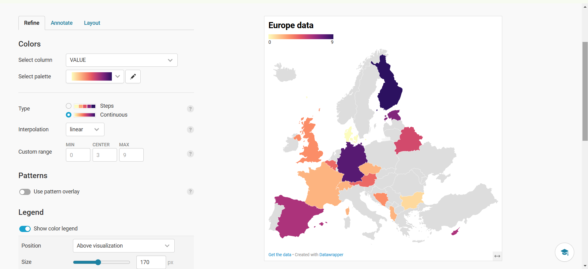
Other kinds of maps are symbol and locator maps. Symbol maps is same as choropleth but uses latitude and longitude to plot scatter points while Locator maps used for highlighting specific locations.
One another important feature is “Teams” which can be used to collectively work on charts with other people. We can create as many as we want and invite others.
from IPython.display import Image, display

display(Image(filename="Screenshot 2025-02-24 035939.png"))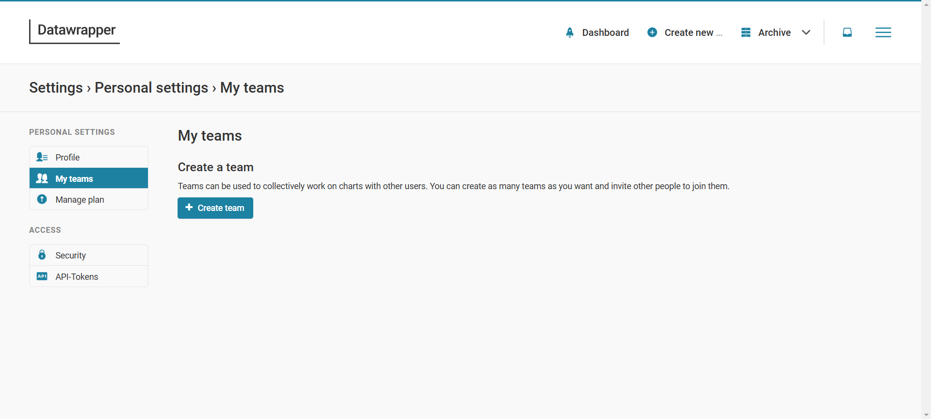
Journalists & Media Outlets (e.g., The New York Times, The Guardian)
Academics & Researchers (for data presentation in studies)
Businesses & Analysts (for reports and dashboards)
Government & NGOs (for policy visualization and public data sharing)
It is a very important tool for masses which are not familiar with programming but need a user friendly software that can help them analyze their given data faster and without much hassle.
Datawrapper is an excellent tool for creating engaging, interactive, and professional-grade visualizations without coding expertise. Whether you need to create a simple bar chart or a complex interactive map, Datawrapper provides the flexibility and ease of use required to turn data into compelling stories.
Youtube channel: https://www.youtube.com/channel/UCGRdsZb9YD3GW35G27g0o0g
DataWrapper Academy: https://academy.datawrapper.de/
DataWrapper Blog: https://blog.datawrapper.de/